Plotting Count Spectra (spectra)
A count spectrum can be plotted by using the Spectrum plotting class.
Energy-Calibrated Spectrum
We will use an example Fermi GBM PHAII file (see PHAII Data for details about PHAII data).
>>> from gdt.core import data_path
>>> from gdt.missions.fermi.gbm.phaii import Cspec
>>> filepath = data_path.joinpath('fermi-gbm/glg_cspec_n0_bn160509374_v01.pha')
>>> phaii = Cspec.open(filepath)
>>> import matplotlib.pyplot as plt
>>> from gdt.core.plot.spectrum import Spectrum
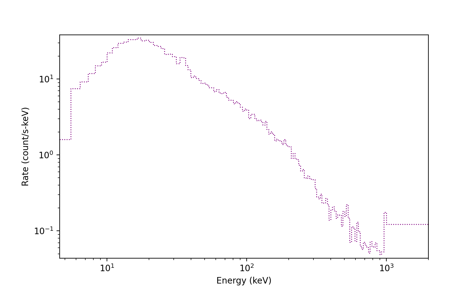
>>> specplot = Spectrum(data=phaii.to_spectrum(time_range=(362.0, 385.0)),
>>> interactive=True)
>>> plt.show()

There are a few things to note in the image. First, we specified a time range
when creating the spectrum, representing the time range over which we are
integrating the data. If this is not specified, the full time range of the
data will be integrated over. Second, while we plotted the full energy range of
the data, we could also specify a range for plotting in
phaii.to_spectrum. Also, the histogrammed data is shown, by default,
in blue, and the standard Poisson error bars are displayed in gray.
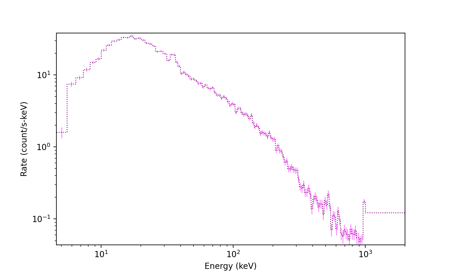
We can access the spectrum and spectrum errorbars objects, which are Histo
and HistoErrorbars objects, respectively:
>>> specplot.spectrum
<Histo: color=#394264;
        alpha=None;
        linestyle='-';
        linewidth=1.5>
>>> specplot.errorbars
<HistoErrorbars: color=dimgrey;
                 alpha=None;
                 linewidth=1.5>
We can customize several properties of the spectrum in this way:
>>> # toggle off the errorbars
>>> specplot.errorbars.toggle()
>>> # change spectrum plot properties
>>> specplot.spectrum.color = 'purple'
>>> specplot.spectrum.linewidth = 1
>>> specplot.spectrum.linestyle = ':'
We can also modify the errorbar properties in a similar way:
>>> # toggle errorbars back on
>>> specplot.errorbars.toggle()
>>> specplot.errorbars.color = 'fuchsia'
>>> specplot.errorbars.alpha = 0.5
>>> specplot.errorbars.linewidth = 1
A background model can also be added to the plot. See Background Fitter for
fitting/estimating background. To add a background model, we require a
BackgroundSpectrum object, which is an output of the background fitter,
integrated over the same time range as the spectrum.
>>> # back_spec is the BackgroundSpectrum object
>>> specplot.set_background(back_spec)
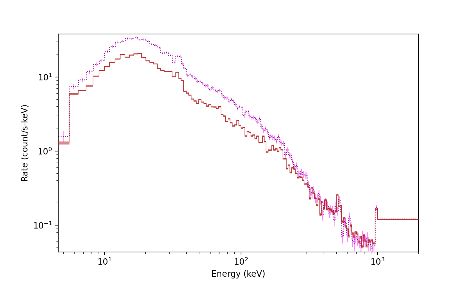
Notice the reddish background line that appears on the plot. Although not
easily seen in this figure, if we zoom in, there is a median background line
and and uncertainty band that represents the 1-sigma background model
uncertainty. We can access the background plot element, which is a
SpectrumBackground object:
>>> specplot.background
<SpectrumBackground: color=firebrick;
                     alpha=0.85;
                     band_alpha=0.5;
                     linestyle='-';
                     linewidth=0.75>
We can also adjust the background element properties:
>>> specplot.background.color='darkblue'
>>> specplot.background.alpha=0.5
>>> specplot.background.band_alpha=0.2
>>> specplot.background.linewidth = 1.5
>>> specplot.background.linestyle = '--'

Finally, we can add selections to the spectrum plot, which are shown as highlighted regions of the lightcurve by default. To do so, we need to take an energy slice of our spectrum:
>>> spec_select = phaii.to_spectrum(time_range=(362.0, 385.0), energy_range=(50.0, 300.0))
>>> specplot.add_selection(spec_select)
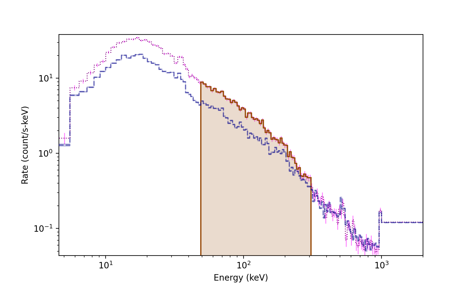
We can add multiple selections to the plot, so they are stored as a list of
HistoFilled objects:
>>> specplot.selections
[<HistoFilled: color=#9a4e0e;
               alpha=None;
               fill_alpha=0.2;
               linestyle='-';
               linewidth=1.5>]
As with the other plot elements, we can also change the selection plot element properties:
>>> specplot.selections[0].color='green'
>>> specplot.selections[0].linewidth = 1

Uncalibrated Energy Channel Spectrum
If we have a count spectrum but no energy calibration, then we simply want to
plot the number of counts in each energy channel. This is represented by the
ChannelBins data object, and Spectrum can be used to plot these as well.
As an example, let’s create an uncalibrated energy channel spectrum from the Fermi GBM data we used earlier:
>>> from gdt.core.data_primitives import ChannelBins
>>> spectrum = phaii.to_spectrum()
>>> # create a list of channel numbers
>>> chan_nums = list(range(spectrum.size))
>>> chan_bins = ChannelBins.create(spectrum.counts, chan_nums, spectrum.exposure)
>>> chan_bins
<ChannelBins: 128 bins;
 range (0, 127);
 1 contiguous segments>
Now we can plot it:
>>> import matplotlib.pyplot as plt
>>> from gdt.core.plot.spectrum import Spectrum
>>> specplot = Spectrum(data=chan_bins)
>>> plt.show()

Notice that by default, the x-axis is plotted in linear channel space, and the spectrum is no longer differential like it is displayed when we have an energy calibration.
Reference/API
gdt.core.plot.spectrum Module
Classes
|
Class for plotting count spectra and count spectra paraphernalia. |
Class Inheritance Diagram