Plotting DRMs and Effective Area (drm)
A response matrix can be plotted by using the ResponsePlot plotting class.
We will use an example Fermi GBM response file (see Instrument Responses for details about using responses).
>>> from gdt.core import data_path
>>> from gdt.missions.fermi.gbm.response import GbmRsp2
>>> filepath = data_path.joinpath('fermi-gbm/glg_cspec_n9_bn090131090_v00.rsp2')
>>> rsp2 = GbmRsp2.open(filepath)
>>> # the DRM of the first response
>>> drm = rsp2[0].drm
>>> import matplotlib.pyplot as plt
>>> from gdt.core.plot.drm import ResponsePlot
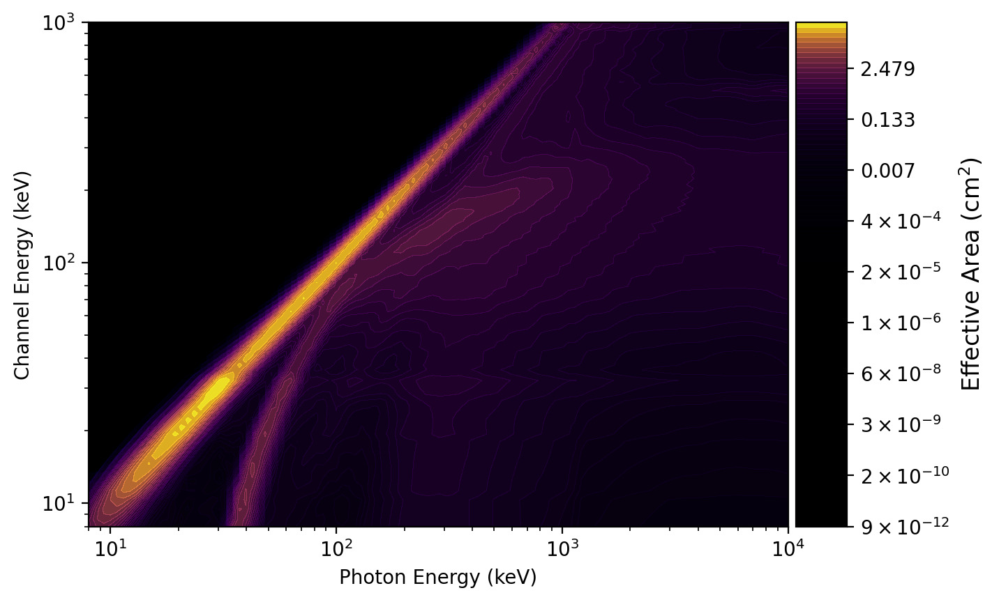
>>> drmplot = ResponsePlot(drm=drm, interactive=True)
>>> drmplot.xlim = (8.0, 1e4)
>>> drmplot.ylim = (8.0, 1e3)
>>> plt.show()

Note the x-axis represents the incident photon energy, the y-axis is the recorded channel energy, and the color gradient maps to the effective area. We have also zoomed in slightly along the x and y axes.
We can directly access the main plot element, which is a Heatmap:
>>> drmplot.drm
<Heatmap: color='viridis';
          norm=PowerNorm;
          num_contours=100;
          colorbar=True>
We can also see the colormap information, which is contained in a GdtCmap
object:
>>> drmplot.drm.color
<GdtCmap: viridis;
           alpha_min=0.00;
           alpha_max=1.00;
           alpha_scale=linear>
The colormap object is specialized to not only produce a color gradient, but
also an alpha gradient. We can update any of these values, in particular, we
can change the colormap to another valid matplotlib colormap by setting the
name attribute:
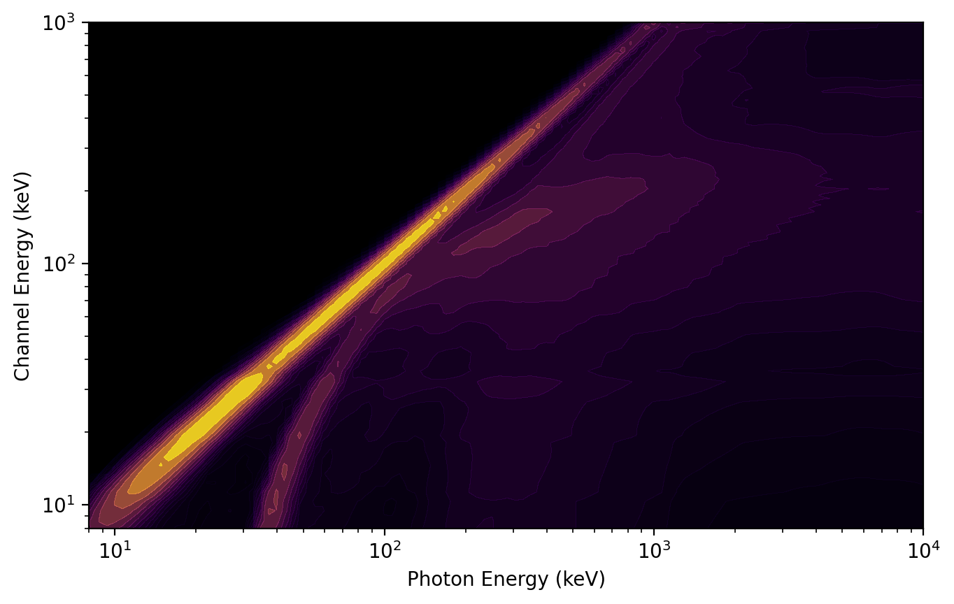
>>> drmplot.drm.color.name = 'plasma'
You can also disable the colorbar on initialization and specify the number of plot contours:
>>> drmplot = ResponsePlot(drm=drm, colorbar=False, num_contours=50)
>>> drmplot.xlim = (8.0, 1e4)
>>> drmplot.ylim = (8.0, 1e3)
>>> plt.show()
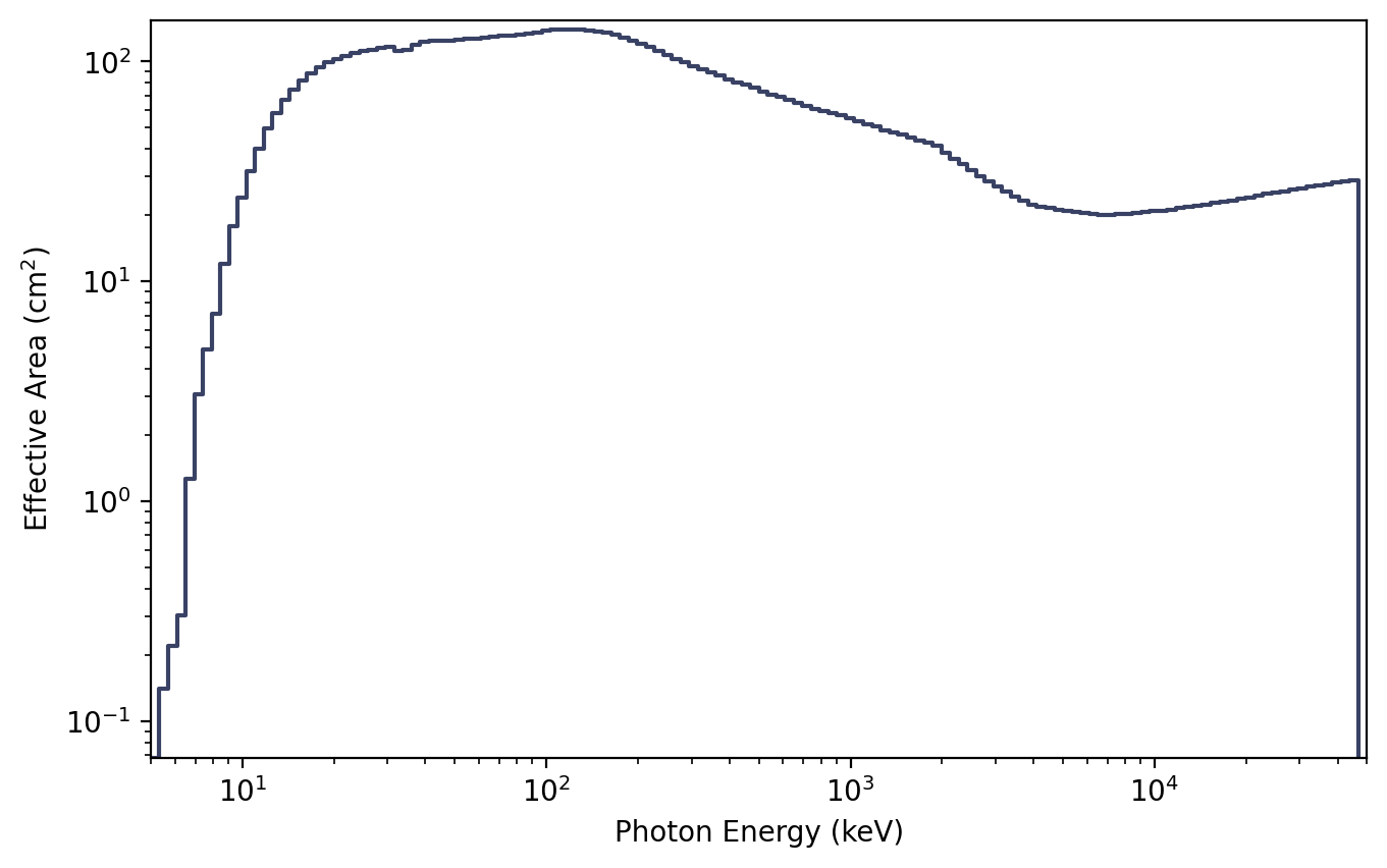
The effective area curve can also be plotted by integrating over either axis
using PhotonEffectiveArea or ChannelEffectiveArea. For example, here
is the effective area integrated over the energy channel axis:
>>> from gdt.core.plot.drm import PhotonEffectiveArea
>>> photplot = PhotonEffectiveArea(drm=drm, interactive=True)
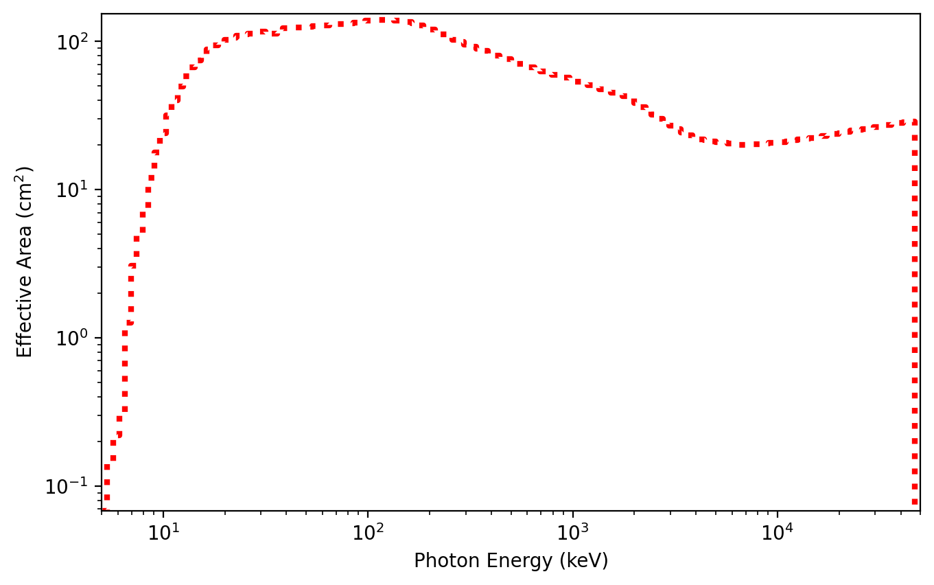
We can also access the plot element, which is an EffectiveArea class:
>>> photplot.drm
<EffectiveArea: color=#394264;
                alpha=None;
                linestyle='-';
                linewidth=1.5>
And change some of the properties:
>>> photplot.drm.color = 'red'
>>> photplot.drm.linestyle = ':'
>>> photplot.drm.linewidth = 3.0
Similarly, we can make the effective area curve integrated over incident photon energy:
>>> from gdt.core.plot.drm import ChannelEffectiveArea
>>> chanplot = ChannelEffectiveArea(drm=drm)

Reference/API
gdt.core.plot.drm Module
Classes
|
Class for plotting a response matrix. |
|
Class for plotting the incident photon effective area. |
|
Class for plotting the recorded channel energy effective area. |
Class Inheritance Diagram
